

Correlations Analysis
This section presents a statistical analysis of data within the selected time interval. The entire page is dominated by a heatmap, which graphically represents the degree of cost correlation between the various elements included in the analysis.
On the side panel, users can view the correlation percentage that each individual aggregate shows with respect to the total cost.
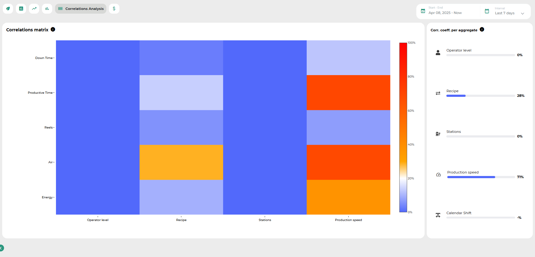
The heatmap is easy to interpret:
Each row corresponds to a monitored parameter (considered a consumable),
Each column represents an aggregation factor,
The intersection between a row and a column reflects the correlation between the corresponding consumable and aggregate.
The color scale ranges from white to red, passing through blue:
White represents zero correlation,
Blue indicates a low-to-moderate correlation,
Red highlights a high correlation.
EXAMPLE
To better illustrate the potential of the heatmap as an analytical tool, the following example is provided:
Let us consider a production facility manufacturing cream cheese.
The consumables to be evaluated include:
Production time
Production waste
Packaging waste
Setup time
Downtime
Raw materials
Water
Energy
The aggregates considered for analysis are:
Supplier
Product code
Production line
Line waiting time
By observing the heatmap, one can immediately notice that the production line used has a strong impact on the overall cost. In particular, it affects setup and downtime, as well as water and energy consumption.
The supplier influences the cost of raw materials and the amount of waste generated, but has a lower impact on water and energy usage and time-related metrics.
The type of cream cheese produced affects water, energy, and raw material costs, as well as setup and downtime. On the other hand, the waiting time on the line does not significantly affect final costs.
All consumables included in the analysis show minimal impact on production time and packaging waste costs.
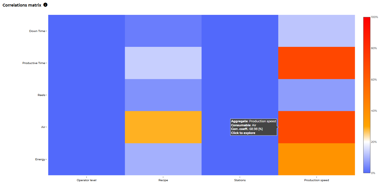
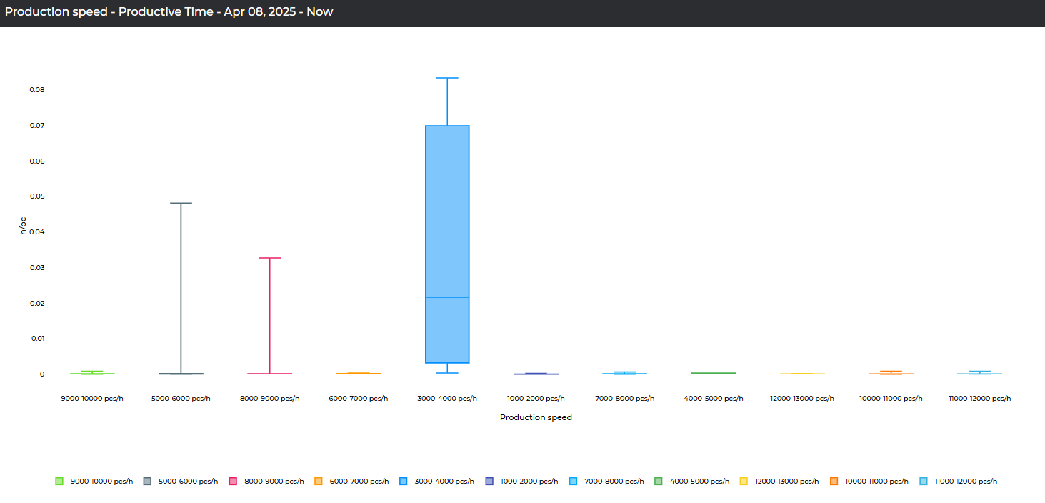
By double-clicking on a cell, users can view additional details about the correlation associated with each possible value of the corresponding aggregate.
Was this helpful?