

Production
It allows for an in-depth analysis of production trends over time, while also enabling a direct and immediate comparison between actual and ideal production values within a selected time period. This makes it possible to quickly identify the root causes of any declines in production capacity.
The page is primarily composed of charts that illustrate how key production KPIs evolve over time. Dashed lines represent the ideal values: the greater the distance between the solid and dashed lines, the lower the production efficiency.
For each production KPI displayed in the chart, the cards on the right side of the dashboard show both the average and total values, calculated based on the time period selected by the user.
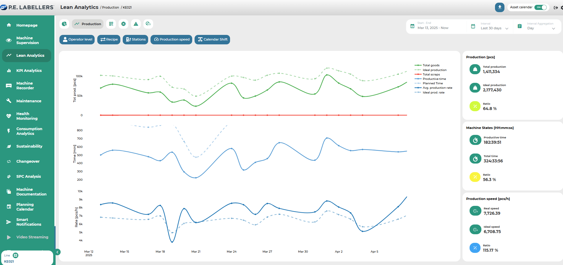
The cards at the top of the dashboard display key production information based on the selected time period. These summary metrics are then further detailed and broken down for each record — that is, for each specific “segment” of production chosen for deeper analysis — in the scrollable table located below the summary cards.
The various controls within the page allow users to perform the following actions:
By selecting a specific time aggregation level, production data can be analyzed by grouping it into hours, days, weeks, or months.
In addition to time aggregation, production can also be further subdivided based on selected grouping factors such as shifts, batches, or materials used. For example, if the selected time period is “week” and the aggregation factor is “material,” the table will show one row for each material type used during that week.
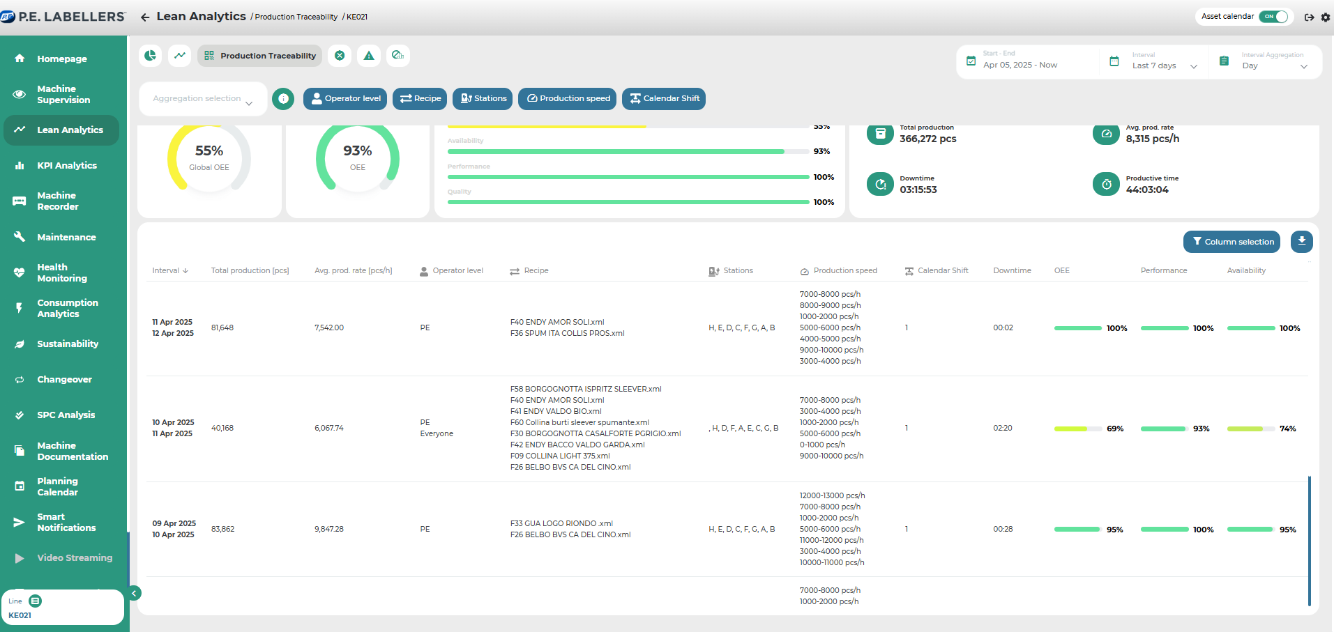
By selecting a specific record — that is, by clicking on a row in the table — users access a dedicated detail view that displays in-depth production data related to the selected record, complete with relevant charts.
Within the detail page shown in Image F, the system provides a comprehensive analysis of the production segment associated with the selected record. Key metrics such as OEE, Total Output, Downtime, and others are displayed.
From top to bottom, the detail page contains the following information:
Start and end date/time of the selected production segment
General performance metrics related to the efficiency of that segment
Cumulative and time-based production charts, machine status timeline, and OEE trend (see Images G, H, I, L)
A configurable Pareto chart where data on downtimes, alarms, or alerts can be visualized
A detailed event log listing all types of occurrences recorded during the selected production segment
Was this helpful?