

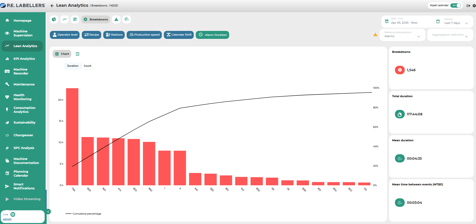
Breakdowns
It provides, in both bar chart and tabular format, an immediate overview of the most impactful downtime causes that have occurred on a specific machine or line.
The side widgets display key indicators related to machine reliability, such as MTBF (Mean Time Between Failures) and MTTR (Mean Time To Repair).
It is possible to visualize the impact of individual alarms in the form of a Pareto chart, both in terms of duration and frequency. This dual view makes it easy to distinguish between infrequent but long-lasting alarms and frequent alarms of shorter duration.
The black cumulative line on the chart represents the cumulative percentage of each downtime cause’s impact on the total downtime. This allows for immediate identification of the most impactful alarm on overall productivity—visible at the peak point reached by the black line.
By comparing the duration-to-count ratio for each type of alarm, users gain instant insight into the relative weight of different alarms on productivity.
In both the Pareto chart and the tabular view, downtime causes are sorted by their relative impact (expressed in percentage and minutes) on the total downtime. This enables a quick identification of the "vital few" most critical causes compared to the many lesser contributors.
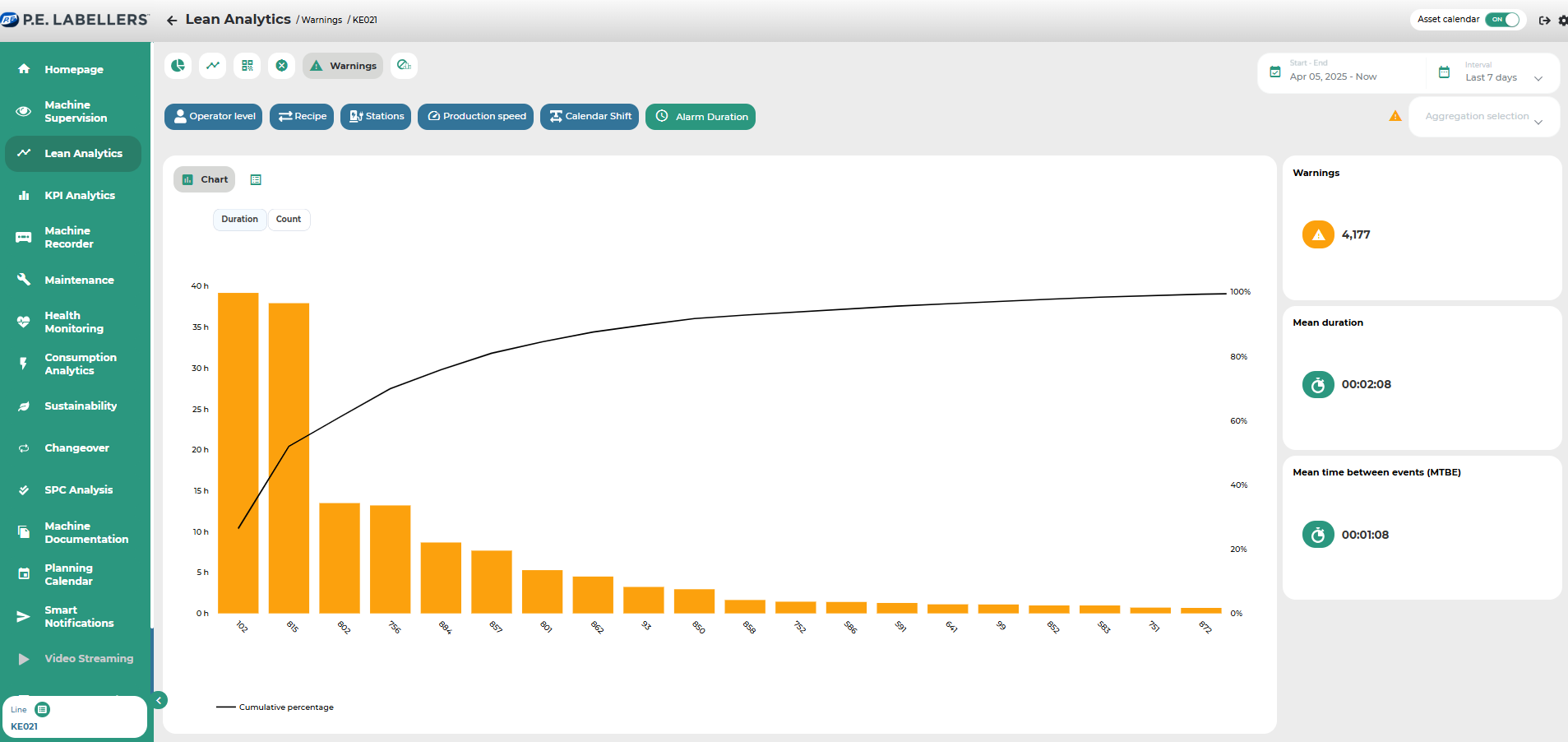
Subsection displaying a table with all currently active alerts and/or those that occurred within the selected time period.
As in other sections, it is possible to define the time interval to be analyzed and, where available, apply filters and use the time bar to select the specific data to be displayed.
Was this helpful?