

Changeover Phases
This section allows for an in-depth analysis of the trend of a selected KPI by focusing on specific format changes. In particular, the user can concentrate on a series of format changes that lead to the same final format.
At the top of the page, several controls are available to configure the analysis:
Time interval: the data used in the analysis will correspond to the selected time range;
Sub-machine: if the reference project involves multiple machines, it is possible to select the specific sub-machine on which to base the analysis;
Filters: as in most pages within MAT, data filtering can be applied to exclude portions of data based on defined conditions;
Phase: since a format change can consist of several phases, the user may apply the analysis to a single phase. Alternatively, the analysis is carried out on the entire format change, treated as the set of its individual phases;
KPI for analysis: the user must select the KPI to be analyzed. Available KPIs include: money lost/gained, time lost/gained, efficiency, average time, number of changes, time spent;
Final format: the data used will relate to format changes that meet the condition of having the specified final format and any of the selected initial formats;
Initial formats: this selector allows multiple initial formats to be defined. The data will refer only to format changes that start from any of these formats and reach the defined final format.
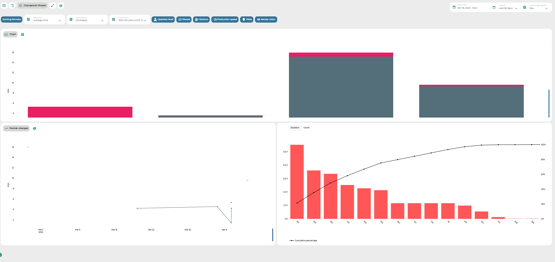
The central part of the page consists of several types of charts:
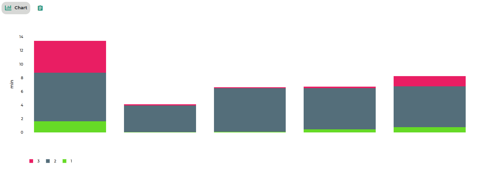
Bar chart (Image B): This chart shows the cumulative value of the selected KPI for each type of format change that matches the selected initial and final formats.
On the x-axis, the initial formats are shown (combined with the final format);
On the y-axis, the corresponding KPI values are displayed. If all phases are selected, the analysis is broken down by phase and all phases are shown in the chart. If a single phase is selected, each format change will only show the bar for that specific phase. Data from this chart can also be displayed in tabular format via a dedicated view switch.
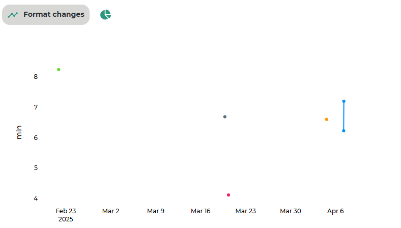
Time series scatter plot: This chart displays all format changes of the selected type that occurred within the defined time range.
The x-axis represents time;
The y-axis represents the value of the selected KPI. Each point represents a specific format change and the corresponding KPI value. By switching the view, a pie chart is displayed instead, showing how the time spent across all selected format changes is distributed among the different phases. Note: if a single phase is selected, the chart will refer exclusively to that phase.
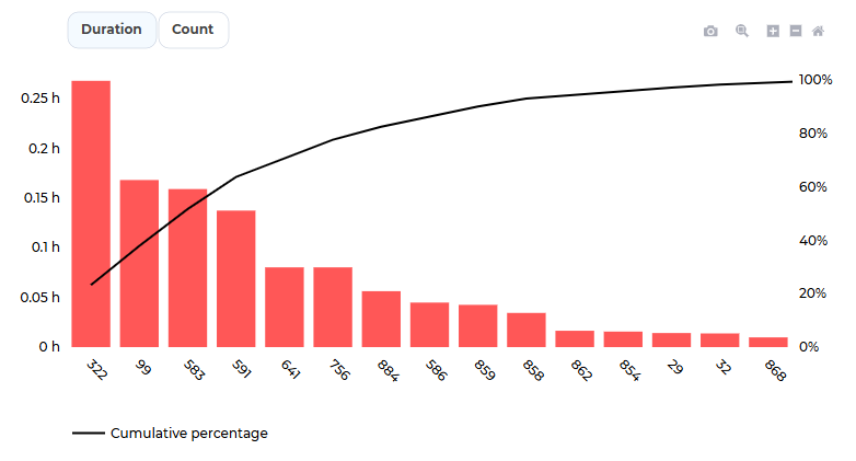
Pareto chart: This chart provides a Pareto analysis of alarms that occurred during the selected format changes.
Was this helpful?