

Changeover KPI Matrix
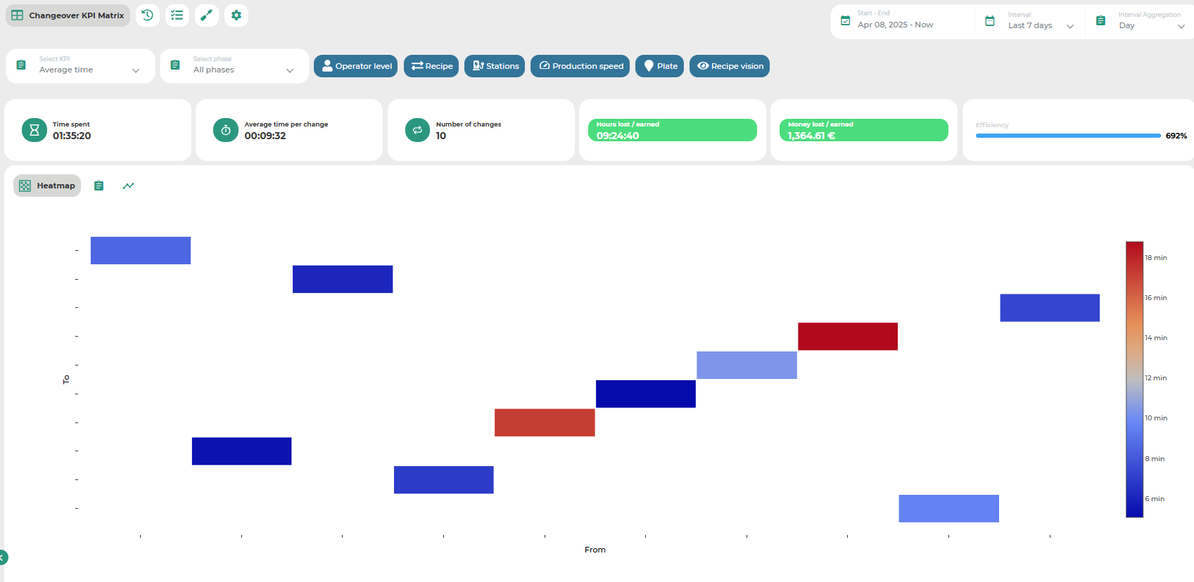
This page is primarily occupied by a matrix that uses different color shades to represent a selected parameter in relation to format changes performed on the machine.
The goal of this visualization is to show how the selected parameter behaves depending on the type of format change. The analysis is based on historical machine data, which means that both the calculated parameter value and the types of format changes displayed strictly depend on the data actually recorded by the machine.
At the top of the page, a set of controls allows the user to configure the scope and direction of the analysis. The configurable parameters include:
Time interval: only data within the selected time range will be used for analysis;
Sub-machine: in case of a multi-machine setup, it is possible to select the sub-machine on which to base the analysis;
Filters: as in most MAT pages, it is possible to apply filters to exclude data that meets certain conditions;
Phase: since a format change may consist of several phases, the analysis can be restricted to a specific phase or applied to the entire format change process considered as a whole;
KPI for analysis: the user must select the KPI to be analyzed. Options include: money lost/gained, time lost/gained, efficiency, average time, number of changes, time spent, etc.
In the central part of the page, the interface displays general statistics calculated on the global dataset of format changes, along with a matrix view that offers a more detailed representation of the selected KPI in relation to each format change type. The color of each matrix cell reflects the value of the KPI. Hovering over a cell displays a tooltip with additional information.
Besides the matrix view, users can choose alternative visualizations such as tabular format or time-series graphs, using the appropriate controls.
Was this helpful?