

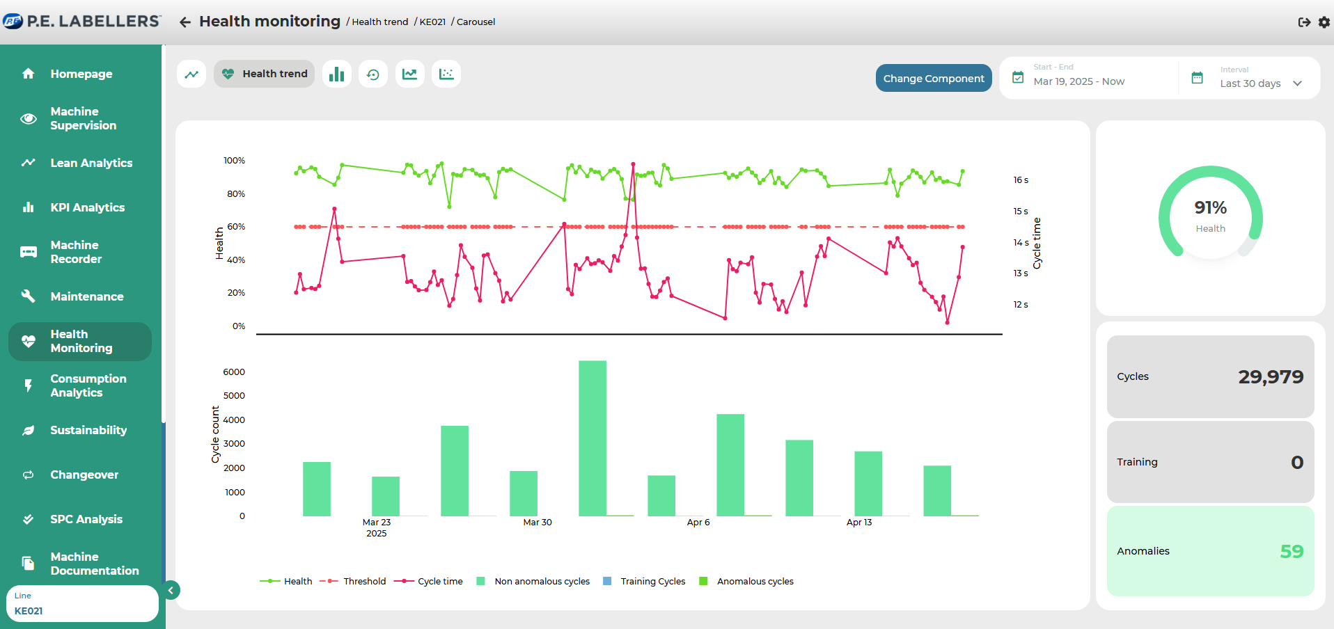
Health trend
Section dedicated to a detailed analysis of the trend of the health status and the anomalous/non-anomalous episodes recorded.
In the upper graph, the trend of the health status (blue line) is recorded in relation to the threshold (red).
In the lower graph, episodes are reported, distinguishing regular ones (green) from those with anomalies (grey). By clicking on the single bar of the graph to investigate, an additional dialogue window opens with detailed information on the individual evaluated cycles.
In the widget on the right, the average health status, total number of episodes, training episodes, and anomalies within the selected time frame are reported.
Was this helpful?