

Features Scatter Matrix
Theoretical Overview
A scatter matrix (also known as a pair plot) is a visual tool used in statistics and data analysis that displays scatter plots for several pairs of variables presented in a matrix format. It is used to understand the relationship between different variables in a dataset. Here are the key reasons for using a scatter matrix:
multivariate analysis: it provides a quick way to visualize and analyze multiple variables simultaneously, which can be more efficient than examining individual scatter plots one by one;
correlation inspection: scatter matrices help in identifying the degree and direction of relationships (correlations) between pairs of variables. Positive correlation, negative correlation, or no correlation can be visually detected;
outlier detection: they allow for the easy spotting of outliers, which are data points that deviate significantly from the general trend. Outliers may indicate data entry errors, exceptional cases, or other anomalies;
trend identification: by displaying trends within the data, scatter matrices can help to understand how variables change relative to one another, which is useful for prediction and modeling;
data distribution insight: they provide insight into the distribution of data points and can highlight whether the data follows a particular distribution pattern;
hypothesis generation: by showing relationships between variables, scatter matrices can help researchers and analysts generate hypotheses for further statistical testing;
Overall, scatter matrices are a powerful exploratory tool to understand complex datasets with multiple variables, especially useful in the early stages of data analysis to guide further in-depth analysis.
Features Scatter Matrix in the MAT
On this page, you can view, for the selected component, a series of scatter matrices that relate all the descriptive variables of a component to each other. This allows you to appreciate the relationship that each variable has with the others and enables you to perform dispersion analysis to better understand the connection between different descriptive factors. Each point within an individual matrix represents a data observation for the two variables relevant to the graph, taken at the same moment.
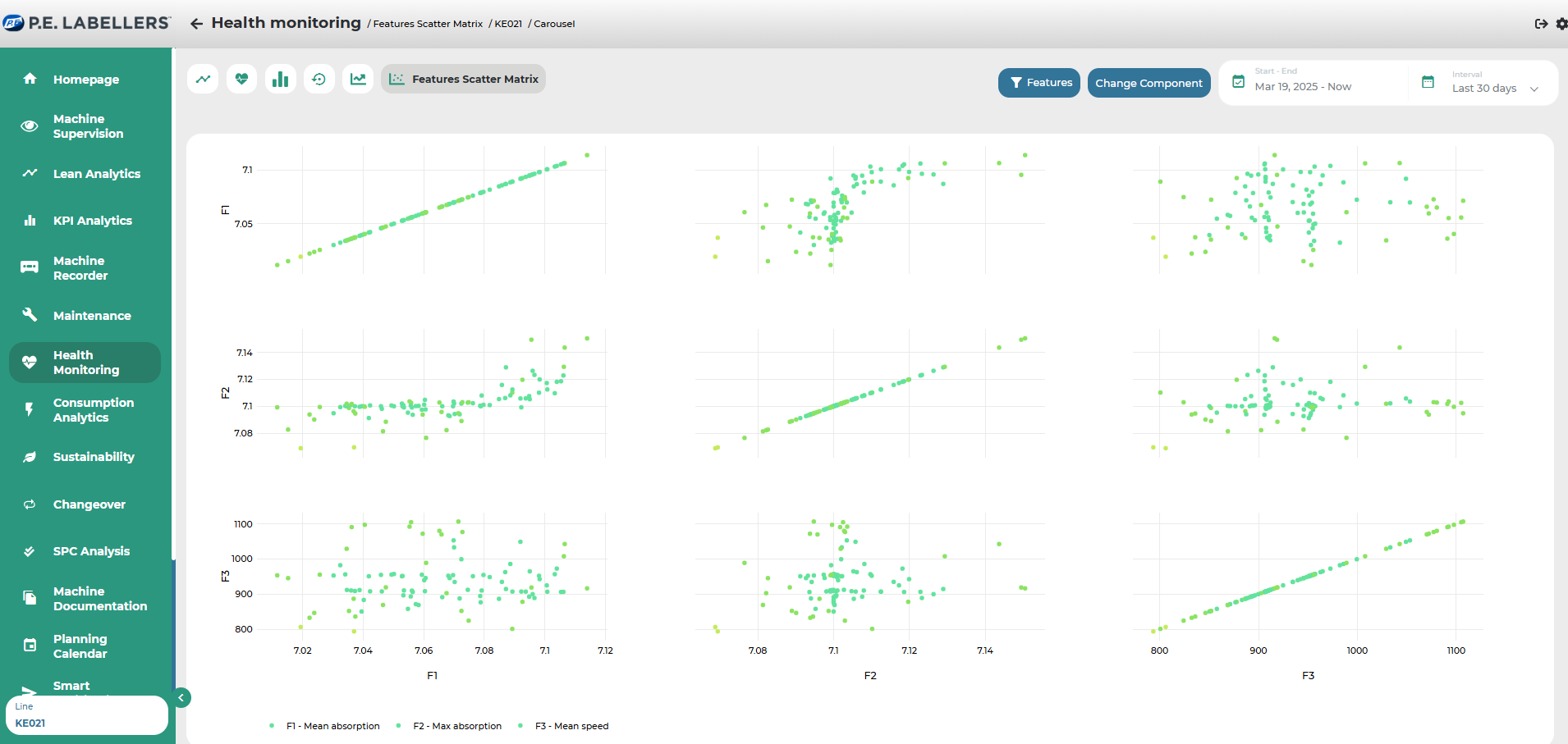
The descriptive variables of the component are repeated both horizontally and vertically, allowing for all possible combinations. It can be observed that the graphs placed on the diagonal of the representation express the relationship of a variable with itself.
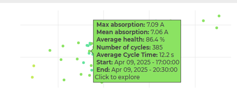
At the top of the page, you can both modify the reference time interval for the data and change the component to analyze. By moving the cursor over the points in the matrices, you can view their details.
Was this helpful?