

Single KPI
At the top bar, the following filters/selectors are available to configure the analysis:
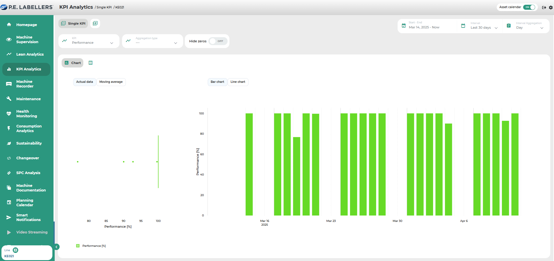
Drop-down menu to select the KPI to investigate.
Drop-down menu to select an aggregation level (e.g., recipe, item, operator, shift, etc.) to assess the impact of the aggregation factor on the analyzed KPI. This allows, for example, the analysis of performance trends by individual product or shift.
Zero filter. For instance, considering the KPI "downtime," which often includes many zero values (such as when a machine rarely goes into downtime), activating the “zero filter” option causes the box plot on the left side of the dashboard to exclude all days (or time buckets in general) with a zero value. This ensures the data distribution is "clean" from noise caused by zero-value days.
For each KPI, its trend over time can be visualized either in terms of individual data points or moving averages, and presented in a bar chart or line chart format.
In traditional technical analysis, moving averages are algorithms that provide a summarized indicator of a value’s trend.
From a mathematical perspective, this indicator is the "average" of a set of data points over time, within a "moving" time window, since it only considers the most recent N data points in chronological order.
The behavior of the selected KPI is depicted through a box plot, which analyzes the distribution of the KPI at different levels of aggregation. Meanwhile, a line or bar chart displays the KPI’s moving average over time, segmented by the aggregation parameter.
Here are the key components of a box plot:
The central line in the box represents the median of the data. Half of the data points are below this value, while the other half are above it. If the data is symmetric, the median is centered within the box. If the data is skewed, the median will be closer to the left or right side of the box.
The left and right sides of the box represent the first and third quartiles (Q1 and Q3). The length of the box (known as the IQR – interquartile range) represents the difference between Q1 and Q3, containing 50% of the observations and showing the normal distribution of the data.
The whiskers extending from the box indicate the spread of values below Q1 and above Q3, which are not classified as outliers.
The isolated points outside the whiskers represent outliers.
Was this helpful?